Sunday, June 27, 2010

One of those things that instigates the smacking of oneself on the forehead with one's own open palm is when one witnesses the intentional manipulation/degradation of rational thought. The below image is of a public bench installed along Lee Road as part of the streetscape improvements. The bench itself is constructed of a steel frame with ipe wood for the bench seats and backs. To those unfamiliar ipe is a fantastic material, very dense and especially hard it weathers fantastically well typically turning from a warm chestnut brown to a fine weathered gray.
The next image is of a bench that has been painted, most likely because someone didn't like how it looked as it naturally weathered or just wanted it to better match the finish of the adjacent business. Both of which reasons are "valid".
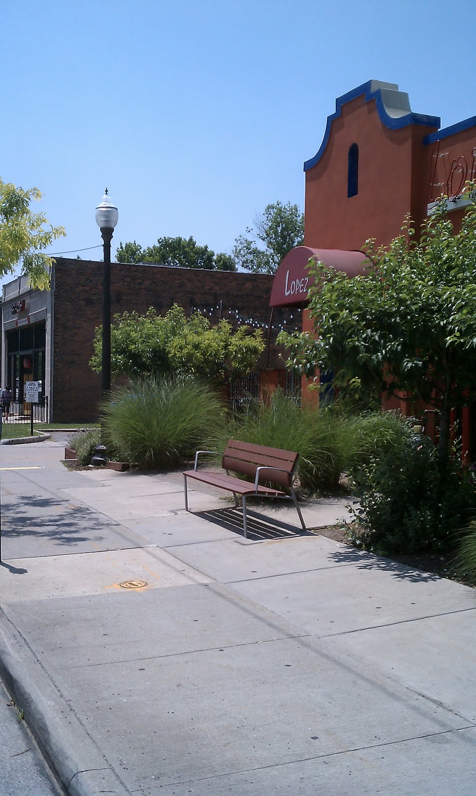
The shame is that if the benches were meant to be painted then a cheaper solution could have been found, especially one whose materiality wasn't an integral part of the design. I find this similar to someone painting a Delorian DMC-12 because the didn't like it in silver. It is an understandable decision logically but it sure breaks one own heart.

Monday, October 26, 2009

Feel the Heat


Taken from the interior of the Capitol Theatre in sunny Detroit Shoreway/Cleveland there are a couple decisions that should be called into question.

First off, naming the lobby after a construction company isn't a bad idea, heck it may mean the craftsmanship in that particular locale is rather fine but when the length of the name starts to interfere with some other built in condition (in this case a big ol' sprinkler head) you should probably start rethinking about the branding.

I don't really know which is more egregious. Making the name of the lobby so dang huge in comparison to the soffit on which it sits or making the decision to just ignore the fact that the sprinkler head looks like another "o" in lobby. The Marous Brothers Construction Looby. I don't know what that is. I do know that I am concerned about the thinking on what is good finish quality at this point, on what is acceptable and what is just good enough to "get by".

Heck, spring for a concealed head or something. I mean, it has your NAME on it. Right there. In BIG friggin' letters.

Wednesday, February 4, 2009

Screw walking, take the F**King bus!

It never fails to amaze me, when public ways are intruded upon with a complete disregard for what the purpose or use of the public way was in first place. The following are examples of a strange predicament that has occurred during the installation of the Euclid Corridor project.

Placement of street furniture and bus stop accoutrement has made it impossible for the city to plow the copious amounts of snow from not only around the bus stop, but also the walkway past it. Here the plow operator just gave up after forming a nice little barricade directly in the pathway.
Here the sidewalk plow was able to snake around some of the light posts, which are cleverly organized to randomly occur along the sidewalk path. It probably makes using a wheelchair more fun and challenging!
The plow person probably took one look at this gauntlet and quit. The random sporadic orientation of the various posts may be some strange commentary on the correlation between the urban environment and the forest but I doubt it. I know I enjoyed twisting the hell out of my ankle though. I would have walked in the street but my mother taught me that people belong on the sidewalk, vehicles belong in the street. Those of us at SBS are very courteous and obedient.
The public goes through the station instead of attempt to circumvent it. (there is hardly any walkway room to go around anyway). The benches (out in the elements) are fantastic low hurdles and the single solitary trash can creates a fantastic dialogue with the strange signage thing that blocks the view from inside the station (but not the wind!).
I want someone to tell me why a bike rack is located here. Who the heck is going to park their bike at this location? This photo is taken from under a bridge, the rack is in a complete blind spot. Probably one of the least safe feeling places around. I can't imagine anyone locking their bike up to take the bus going east (away from University Circle) down Euclid. I suppose it is a safer place to put your bike if you get a flat... The poor fire hydrant stands guard.

To summarize:
- In Cleveland it snows. Probably a lot. When you locate things on public walkways you may hinder more than just pedestrian traffic, you may completely impede the ability to keep the walkway passable.
- Putting things in public way is generally a poor idea and should be seriously considered before undertaking. That being said try to coordinate whatever you HAVE to put in the public way so as to avoid a convoluted mess such as the above.

I wish this were an isolated incident but I assure you it is not. This happens quite a few times along the new Corridor's path along Euclid. Enough that it seems almost deliberate.


...but most of the time things stay just as sucky.

("things change" is the art/impedance to the plowing from the first picture)

Google Map Location

Tuesday, November 25, 2008

One of these things does not belong...

Despite the expected accolades from the typical (seemingly uninterested) parties one should start to question the validity or recreating/reinventing an urban streetscape without attempting to solve the continued issued of updating and streamlining infrastructure. This particular photo is a little late being taken over the summer when the Euclid Corridor was having it's sidewalk installed around East 9th and Euclid. Next to the Porta-john are two of the many above ground electrical cabinets which pepper and infringe upon the sidewalk adding to the massively uncoordinated hodgepodge of obsticles pedestrian are expected to avoid. One wonders from where did these sudden metal stalewarts emerge? Well, most of them used to be located within underground vaults, out of site and out of the way. Perhaps (admittidly) a little more difficult to access for maintenance and no doubt more expensive but I am curious what inherent statement is being proclaimed. Either Cleveland doesn't give a shit about it's appearance or Cleveland is too imcompetant to coordinate a streetscape project that involves ONE STREET. Not a huge city masterplan, not a neighborhood redevelopment plan but one freakin' street.

Even Public Square, that celebrated "image" of the city, arguably Cleveland's front door (if one were to take public transportation to get downtown or park in the copious adjacent surface parking) is randomly peppered with unattractive metal cabinets, usually positioned in such a way as to form a cohesive chokepoint with lamp posts.

Some may be concerned that SBS is overly sensitive about this but to be honest SBS is relatively sick of Cleveland and Northeast Ohio's management insulting good taste, competence and logic by continuously rushing to poor decisions or simply not caring. It says nothing positive for our region or inhabitants if this is us "putting our best foot forward". In fact it makes us look like a bunch of unsophisticated asses.

Friday, August 22, 2008

Finer points...


After reading Mr. Litt’s high praise for the re
cent work at CSU designed by CBLH, a colleague and I decided to share in his joy. I will not comment on the design diarrhea as this is not the forum for discussion of bad taste.


It does preface these curious details over the doors that leave one wondering if anyone was actually paying attention when this project was designed and constructed. Someone obviously took the time to draw this detail somewhere in the documents with no actual thought for how it would be realized in the field.


I am not sure what the intention is, as they do not align with anything, and are resolved quite poorly at the head return. While these will not lead to water infiltration, or a poor thermal seal, they are an insult to the design profession, and gypsum board contractors.


Sunday, August 10, 2008

Water flows which way?

Here's a head-scratcher. The new crosswalk from Tower City (Higbee) east across Ontario has an interesting angle to it. The sidewalk in front of Higbee slopes down to the west and the crosswalk ramp is placed at the proper angle to the sidewalk, but not the crosswalk. In short, the ramp is nearly level and when it rains, it fills up with water. Here's a picture during today's deluge. - July 9th, 2008

We have noticed this in quite a few spaces around the city. For some reason the curb cuts for crosswalks are usually the lowest part of the street (because the road is crowned for runoff but also because no attempt is made to pitch away from the cuts) so water and slush collect there, impeding travel for pedestrians. One would think that careful consideration would be made to keep crosswalks dry and clear of standing water, snow, slush, mud, anything that people would not want to step in since, as a general rule, its main purpose if for people to walk in that location.

SBS should also comment that no one on the staff is a professional engineer in any manner however we do know that water goes what way? Downhill. These curb cuts should be either designed or constructed with that in mind.

On a completely unrelated note we at SBS received message that the Key Bank overhangs may be resultant of having a "Key Bank style" that includes the use of overhangs whether needed or not.

When Fire Codes Attack!

again, not really a bad detail but relevant. these photos are taken inside the building and housing department at city hall. both are at the top of a 5 story path of egress. these are not rated doors and the building was built prior to such codes. however, a closed glass door would certainly do more to prevent fire and smoke spread than one propped open creating a stack effect. one would think that the department who enforces the current codes, under the general parameters of protecting its citizens, would adhere to the standards they are enforcing.

They are using blocks to keep the doors open because the doors are on closers to create at least some level of protection? Maybe? Is it better to enforce the codes or is it better to understand why certain ones exist in the first place? Are you supposed to use question marks at the end of rhetorical questions?


Monday, June 2, 2008

Hang over or overhang

I was told about this occurrence but didn't believe it could possibly exist until I had seen it with mine own eyes. Apparently the Key Bank along Euclid Chester Avenue around East 36th suffers from such low sun angles (as opposed to the rest of the city) that they not only used an overhang but also outfitted each window with its very own awning.
Let us ponder this for a minute. At what point did someone look at the elevations of the building (which HAD to have shown the overhangs) and thought, "You know what this building needs? Awnings under the overhangs!"
"That's SO avant-garde!" exclaims the owner or whomever was being asked to verify the decision. "Key Bank branch #458 will be the banking icon of the CENTURY!"

"It's ironic enough to be hip." murmured the unpaid intern deciding to later write about it on his myspace page or whatever kids write in these days.

The part that concerns me is I almost wonder if the awnings were a requirement of some absurd zoning restriction that necessitates awnings over the windows of all commercial properties. This would also mean that the architect/owner/builder decided not to even broach a variance but instead just gave up and built the thing as specified. I could further speculate on why this mess occurred but would rather just forget it for now. It has already garnered too much attention.

Monday, March 24, 2008

Did the city only pay for half?

...located on the south side of Euclid, west of 150 East Euclid, 44115. Why do the bricks make this strange detour? Earlier in the year it was even stranger as they did a good job of merging the two brick patterns toward the 2nd street alley...I had been waiting to post these photos mostly because someone had convinced me that when the bank had moved in they were going to install some sort of ATM vestibule or something on the concrete. Well, the bank is in and the concrete part of the walk still lay exposed.
I have not received a decent explanation of why the brick is treated this way, why the brick walk doesn't go all the way to the building?

Seriously, what the heck?

Thursday, November 22, 2007

Exhaust vent design element

At first glance I assumed that a Dalek was hiding or trapped behind this simple wooden fence assembly (remember their biggest downfall was that they couldn't climb stairs) but upon further inspection it became evident that this particular structure was an exhaust vent for some mechanical unit.

The word of the day for this particular example is going to be 'coordination'. I don't particularly know how one could miss a structure of this size in the middle of the plaza (even during CD phase) and I sure can't figure out when the engineer who placed it here lost all sense of aesthetic sensibility or which contractor shrugged his shoulders and said "Sure, whatever." during construction but someone should have noticed this, asked about it and resolved the issue.

I will update with a zip code when I figure out where this is.

Tuesday, November 20, 2007

ADA inaccessible

I don't quite understand how this detail is supposed to work.

I think there needs to be a sign:
"To orient mirror for ADA use, place hand on top of mirror and gently pull away from the wall until the hinges lock. Now sit back down in your wheelchair and use the mirror.
~Kent State University"

Interesting...this is apparently the mirror in a public men's facility in a dorm building.


Friday, July 27, 2007

Fire suppression - Old Skool Style

Not really a design problem, unless this particular rope was actually specified as part of the fire surpression system. Think of it like this...

-Building on fire.
-Fire burns rope which closes fire door (not on hold opens) creating a fire barrier
-Releases tension on valve allowing manifold to open supplying the sprinkler system
(not shown from this point on...)
-Sprinkler system fills bowl with water lifting gate via pulley on cage of mice
-Mice exit cage and run across a series of bridge to plate of cheese
-Pressure on bridge dials '9-1-1 emergency' on push button phone
-Additional weight to plate of cheese pulls blanket from off of parrot cage
-Parrot repeats address of structure over and over for 911 operator until extinguished from smoke inhalation

Tuesday, June 5, 2007

Cut once, measure twice...

Located on the Fries and Schuele building in ohio city, these blue ceramic glazed tiles are located in the center of the brick piers that form the base of the building. Notice the fine attention by the architect to make these piers a masonry dimension so that the tile would seamlessly fit into the running bond pattern.

1. It looks as if the header bricks were shaved to accept the tile.
2. The cut brick on the right seems smaller then on the left.

3. One would feel more comfortable if the tile fit into the running bond pattern instead of breaking the pattern by thirds. If the tile were centered on the pier that should be the case. I am assuming that the pier is not a masonry dimension or there are some 'pigs' in the wall. I don't know if a wider shot would show more of the discrepancy. Maybe, maybe not. (-ed)


Saturday, March 10, 2007

Something missing?

Stonebridge - 2222 Detroit Avenue, Cleveland 44113


Walking around this recently completed apartment complex on the West Bank of the Flats, one wonders how many members of the design and construction team overlooked these enormously visible corners and crevices (or lack thereof)...


In defense of the construction team, I would like to speculate several reasons why it looks like pieces of building are missing:

1. The construction and design team foresaw the natural expansion of face brick as it gains moisture. I would suggest that at least three inches between the face of each wall should accommodate this expansion nicely. (Make sure that insulation fills the gap and remains visible as an indicator of the gradual expansion process)

2. LEED points can be earned for creating habitats for critters of the urban environment. In particular, hornets, ants, and Lake Erie seagulls are provided a warm home for their families.

3. No one really walks anymore. The apartment complex contains garages internal to every building, therefore its residents prefer attention to the interiors of their home and really don't see the outside of the building at fewer than 30 miles per hour or a few hundred feet away. In fact, Phase 13 of the complex will project a holigram on a CMU box, because no one really notices materiality anyway.


As a former residential painter, I particularly admire the skill of this project's artists. I would have never thought to two-tone the soffit AND paint the cast stone white.

This is what happens when an incapable design and construction team tries to build an angular and "patchwork" building. Inevitably, no one knows how to detail areas where materials and faces adjoin one another.

Thursday, March 8, 2007

Remember what climate your project is in:

southwest corner of east ninth and st clair ave, cleveland ohio 44114

do you think the sign was included in the drawing set? perhaps with a note: please provide portable signs to make up for architect's ignorance and/or ego. disperse around glass in the rare occurrence of snowfall.Possible solutions included Snow Guards of some sort to decrease the possibility of ice or snow sliding off onto the head of a passerby, a covered entry or walk or just not sloping an extremely smooth roof surface towards the entry/sidewalk.

On an SBS personal note, this is the second email we have received! Keep your eyes open and the camera at the ready.

Monday, March 5, 2007

Batten the hatches?

sbs's very first write-in!

battery park, detroit shoreway, cleveland ohio 44102

note the fine attention to detail regarding the battens and their relationship to the fenestration.

also of interest are the sun screens (these face north and the only sun that will hit this facade is late in the summer and it will be low on the horizon) and the entry canopy which provides no protection.

use what you like


I like it all.
So, in summation, exterior material was installed or designed with no regard to what was happening to the exterior AND useless architectural details which pose as useful details.

I think the green beveled batten picture is my favorite.


Monday, February 19, 2007

Display Building and Greenwashing

This project was from the 2007 Cleveland Home and Garden show. It was an attempt to display sustainable design principles, probably in a manner that would be understood by the layperson.
- One example of sustainable design quoted here was the collection of rainwater for land irrigation. I understand that the display building was built inside another but wouldn't the addition of a water collection system (ie. gutters) have been useful for explaining exactly how the water was collected? Notice the nice fountain catapulted from the turret which has the possibility of collecting water from around 30 to 40 square feet yet leaves the rest of the roof entirely unattended.
- I thought the fountain splash (from a pump operated fountain) collecting on and eventually migrating through the turret window was a nice touch.- I don't know if not lining anything up with the "trim" was an intentional decision or not. If it was I would call it "bold" to be nice. If not, then someone should have kept there eye on project construction a little more closely.

I have more photos of this particular project but don't want to harp on "when bad ideas/construction attack". What infuriated me most was the blatant exclamation of how "green" this project was with little or no innovative ideas to support it. Sure there was a sign for low VOC paint and there was a gigantic solar array on the roof (old fashion PV to be sure, nothing new and exciting). I am not sure but I think the wall construction was Structural Insulated Panels which was a nice idea but how would anyone even know? What about solar orientation? There sure seems to be a lot of glass! Where was the practical application that would be a take home lesson? Maybe at another booth.

Hell, I am surprised the thing wasn't clad in vinyl.

Welcome to SBS.

IX Center Website